


Project Overview
Reengineering Financial Wellness for the Family CFO
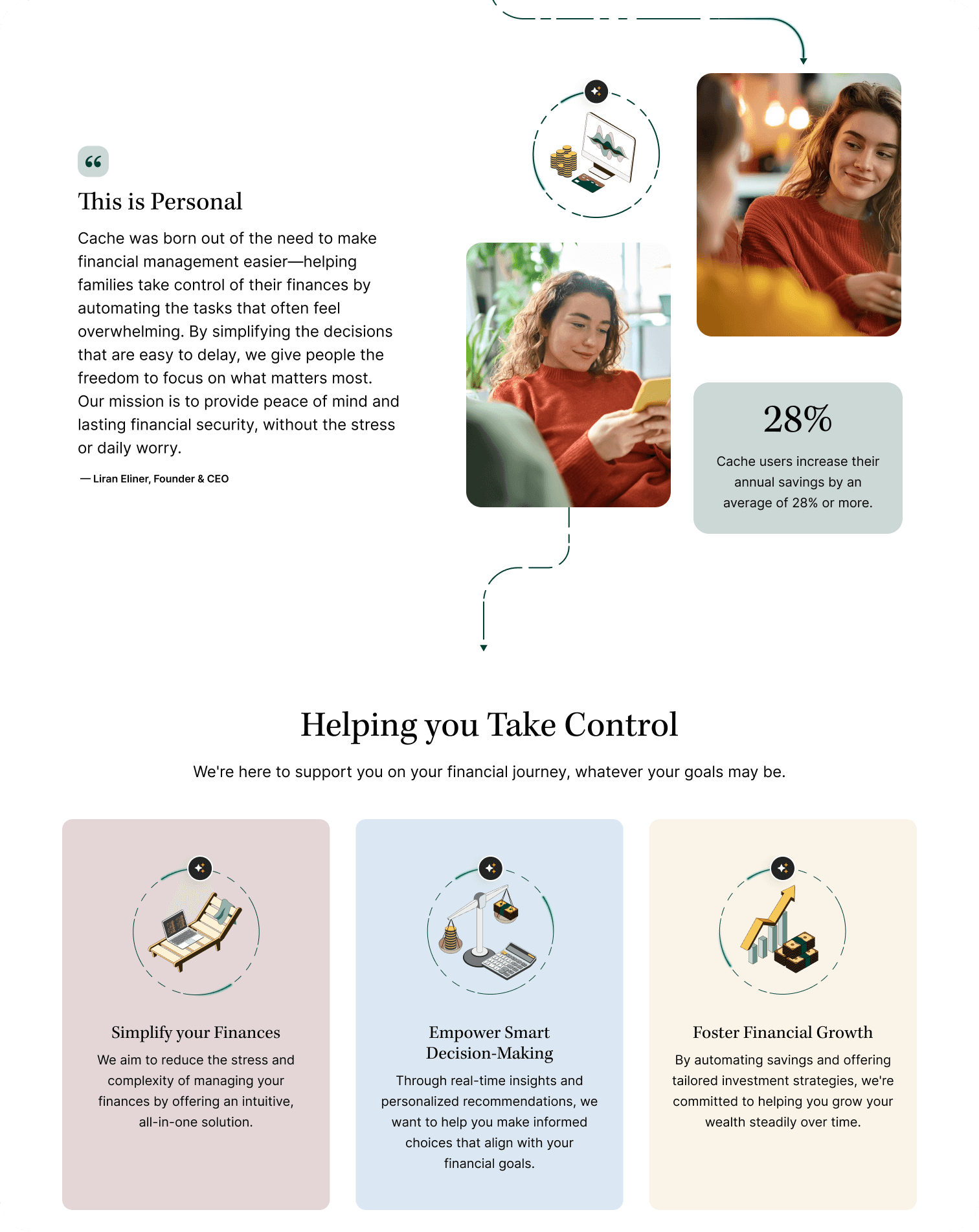
Cache is a fintech platform that automates savings, credit optimization, and debt repayment for the “family CFO”—everyday households who want to eliminate financial busywork without managing spreadsheets.
HALO rebuilt Cache’s entire website and brand system to reflect its core intelligence, clarity, and trustworthiness. The new modular, dual-purpose experience serves two audiences equally well:
End consumers (time-poor, finance-aware self-starters)
B2B partners (banks, credit unions, fintechs) interested in embedding/white-labeling Cache
The result: a secure, intelligent, human-centered ecosystem that makes automated money movement feel effortless and trustworthy.
The Challenge
From Visionary to Tangible
Cache offered genuine automation (active money movement across accounts) but its original site failed to communicate this in a crowded fintech landscape of basic budgeting apps and goal trackers. The product functioned, yet the website lacked the clarity, trust signals, and emotional resonance to match.
Without a cohesive narrative and differentiated experience, Cache risked blending into generic “set-a-goal” tools.
The Process
From Fragmented to First-Class: Strategy & Differentiation
We began by grounding the brand in a single, unifying principle:
Approachable automation for real people—not techies.
Through user interviews and market analysis, we identified clear whitespace: few platforms were meaningfully addressing the everyday household user—the “family CFO.” Cache’s architecture offered true automation, but its story needed to connect technical capability to real-world benefit.


Four Strategic Pillars


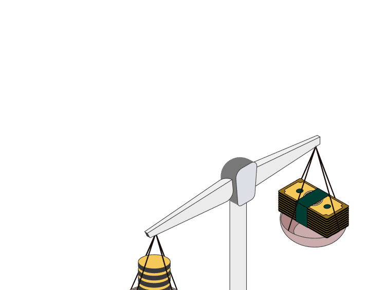
Real automation: Unlike pseudo-automation apps, Cache actively moves money across linked accounts—dynamically optimizing for interest, credit, and liquidity.
No custody, no risk: Cache never holds funds. Users remain in full control.
Outcome-Based, Not Goal-based: There are no arbitrary targets—only outcomes configured around what matters to each individual user.
Trust by Design: We made the narrative explicit: “Your money stays at your bank. Cache just moves it—exactly as you tell it to.”
Messaging: We helped shape a clear messaging hierarchy, mapping features to benefits to life outcomes.
Automate savings → earn more interest → enjoy more freedom
Optimize credit → protect utilization → qualify for more, pay less
Set it and forget it → eliminate money chores → gain peace of mind
This structure guided the homepage, dashboards, onboarding, and content.
Experience Architecture & Design System
Visual Identity Rooted in Confidence and Clarity
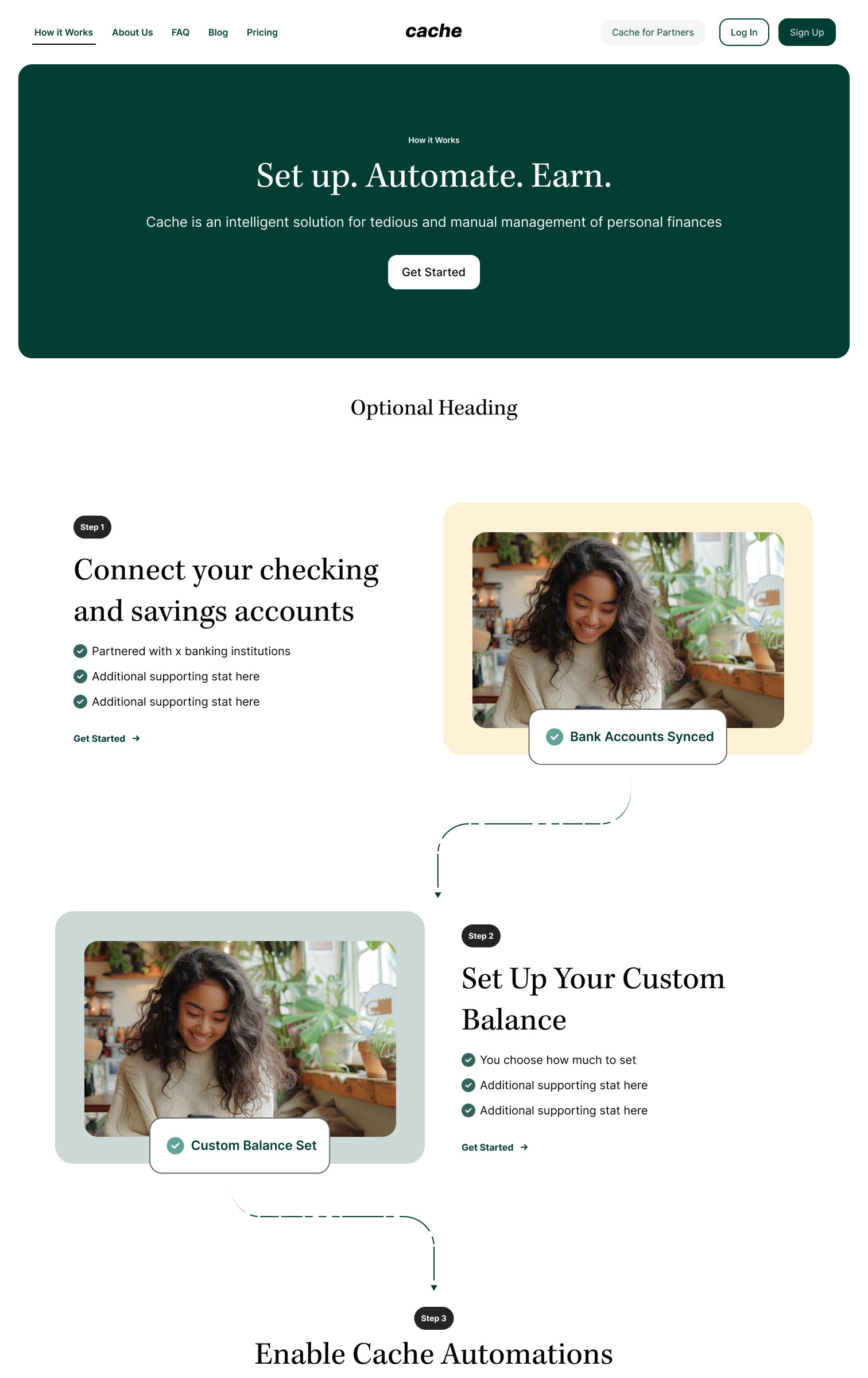
A governed design system enabled scale—using calm tones, editorial type, and cards to make invisible automation feel clear and trustworthy.
Brand & UI System
Color Palette: Evergreen base with warm neutrals and an 8-tone accent system (e.g., jade, rosewood, sandstone).
Typography: Editorial serifs for credibility, humanist sans-serifs for UI clarity. Defined hierarchies across desktop and mobile.
Components: 40+ reusable UI modules (atomic and organism) buttons, inputs, headers, tiles, steppers, testimonials, pricing cards, pagination and avatars —purpose-built for rapid expansion.
Illustration & Motion
Isometric Iconography: 50+ custom illustrations visualizing cashflow, cards, calculators, and savings logic—reinforcing abstract processes through storytelling.
Real-Life Scenarios: We avoided stock imagery. Instead, we designed bespoke imagery that reflect relatable user contexts, supporting product education and emotional resonance.
Motion Language: Rive for premium state transitions and micro-interactions. Lottie for scroll-based education and subtle reveals


The Result
A UI system built for trust, legibility, and delight
Giving Cache’s team a durable foundation to scale new pages, features, and campaigns without reinventing the wheel.


CMS & Front-End Stack
Financial services demand clarity, compliance, and agility.
Built for all three, ensuring the system told two stories: consumer value and partner opportunity—across CMS modules, demo CTAs, and audience-specific content blocks.
Site Architecture & CMS: A contentful modular setup lets non-technical teams manage content, trust copy, and FAQs with ease. A custom, CMS-driven FAQ accordion—searchable by category—reduces support requests and improves UX. Dedicated security modules clearly explain Plaid, FDIC safety, and Cache’s non-custodial model. Stepper patterns guide users through key decisions with clear progress and actions.
React Front-End: A component library mirroring the design system for performance, fidelity, and rapid iteration. Built-in A/B testing, analytics tagging, and animation support enable fast learning.
The Impact: Design, development, and CMS work together to deliver a product that’s fast, safe, scalable, and human.
Re-Architecture
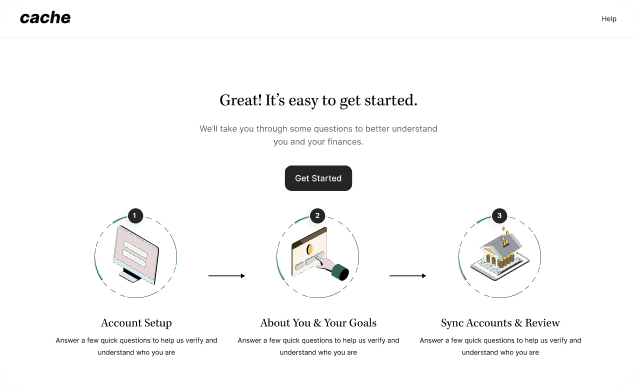
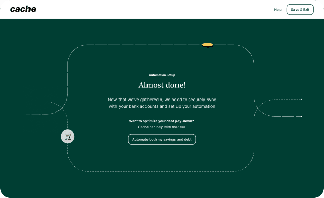
Onboarding reimagined as a Guided Experience
Focused on early trust, transparency, and value realization. It’s not “connect your bank.” It’s “Tell Cache how to help.”

Warm Welcome
Friendly KYC intro (“Nice! Let’s get started.”) → security + warmth.
Personalized
Conversational questions to tailor automations → early relevance, lower drop-off.
Value Preview
Visual “Cache Flow” showing personalized impact → users see benefits before committing.
Partnership Framing
Inline education, soft animations, feedback → frames as collaborative control, not just bank connection.
The Solution
Calm, clear, and trustworthy—soft visuals and editorial type connect features to real-life impact, with automation quietly supporting control and peace of mind.

Calm colors, soft cards, editorial typography, narrative motion
Every touchpoint ladders from feature → benefit → life impact

Explicit non-custodial messaging, visible guardrails

Scroll-based pacing, contextual cards, animations for momentum and comprehension
The Results
From MVP to Market-Ready Platform
What started as a promising single-feature MVP evolved into a category-defining, market-ready platform: a trusted, hands-free financial operating system for households.
In a market full of control-focused dashboards, Cache delivers relief through true automation. The project demonstrated that coordinated brand, UX, content, and engineering—centered on trust and clarity—create not just a better product, but a stronger, more compelling promise.